4
Min Read
9 B2B Healthcare Web Design Examples That Got It Right
See 9 B2B healthcare web design examples that win clinical, administrative, and procurement buyers, what each site does well, and why it works.

4
Min Read
See 9 B2B healthcare web design examples that win clinical, administrative, and procurement buyers, what each site does well, and why it works.
Search “healthcare web design examples” and you get the same gallery every time: glossy hospital sites, clinic booking pages, provider directories. All of them built for one visitor, the patient.
None of that helps you if you sell into healthcare. Your buyer isn’t a patient booking a physical. It’s a clinical champion, a hospital administrator, an IT reviewer, and a procurement lead, and they rarely agree on what matters. Most B2B healthcare sites are built like the patient still landed on them, so the clinical buyer bounces and the committee never forms.
This article fixes the gap. Nine B2B healthcare sites that sell to clinicians, committees, payers, and life sciences teams, with the specific structural and messaging decisions that make each one work. We judged them against a consistent rubric, and we gave more weight to sites with published performance data than to sites that just look good.
A quick note on who’s writing this. Takeoff is a B2B web design agency for established companies with long sales cycles, and we built three of the sites on this list. One of them, Trella Health, saw demo requests climb 385.71% after launch. So some of this is our own work, and we’ll say so each time.
This isn’t a taste test. Every site got held to the same four questions, the same ones we ask when we start a healthcare redesign at Takeoff.
Messaging clarity. Can a visitor say what the company does, who it serves (health systems, payers, life sciences), and why it wins, within a few seconds of landing?
Committee routing. Does the structure give the clinical champion, the administrator, IT, and procurement a path to what each needs, or is the site organized around internal product names?
Evidence and trust layer. Are clinical evidence, outcomes, customer logos, and security and compliance answers built into the journey, or buried on a secondary page?
Conversion paths. Is there one obvious next step per page, matched to how far along the buyer is?
Built for search and AI answers. On every Takeoff redesign, SEO and AEO are designed into the build, not bolted on after. We run keyword and content research up front, audit and preserve the URLs that carry equity through migration, and structure the top-level navigation around the bottom-of-funnel pages buyers actually search, so the site earns organic traffic and gets cited in AI answers instead of hoping for it.
There’s a fifth thing we care about that we deliberately left off the scorecard: published performance. Where a site, or our work on it, has real numbers, we trust that more than visual polish, and you’ll see those called out in the individual entries. We didn’t score it in the table because a redesign’s own results and a company’s product or customer results aren’t the same measure, so lining them up in one column would compare two different things. For context, published B2B benchmarks put website conversion in the low single digits, roughly 2 to 3 percent (Ruler Analytics), so when a redesign measurably lifts the right organic traffic and on-site engagement, that’s the difference between a site that sits there and one that feeds pipeline.
Here’s how all nine score on the four design criteria.
| Example | Messaging clarity | Committee routing | Evidence & trust | Conversion paths |
|---|---|---|---|---|
| 1. Trella Health | Strong | Strong | Strong | Strong |
| 2. AlayaCare | Strong | Strong | Strong | Strong |
| 3. Freshpaint | Strong | Strong | Strong | Strong |
| 4. Abridge | Strong | Solid | Strong | Strong |
| 5. Virta Health | Strong | Strong | Solid | Solid |
| 6. Cedar | Strong | Solid | Strong | Strong |
| 7. Commure | Strong | Strong | Strong | Solid |
| 8. Komodo Health | Strong | Solid | Strong | Solid |
| 9. Viz.ai | Solid | Strong | Strong | Solid |
Strong / Solid is our editorial read of how well each site meets the criterion.
Here they are, in order. Three are our own redesigns, and we’ve flagged those.
Trella Health sells hospital workflow and post-acute care software to hospitals and post-acute providers. It’s a complex clinical product, and the old site treated it like one.
What the site does differently. We rebuilt it around how buyers actually search for and evaluate the product, not around Trella’s feature list. The hero drops you into a choice between two buyer jobs, “I need to see my market opportunities and grow referrals” and “I need to reduce length of stay and avoid readmissions,” so a visitor self-selects into their own problem before they scroll. SEO and AEO were built into the redesign, not bolted on after.
Why it works. Committee routing and messaging clarity at once. Two buyers get two doors, and the terms they’d actually search are baked into the structure, so the site earns the traffic and then routes it.
What we like about it
How we built it. Trella sells a post-acute care sales and analytics platform, and the old site buried that under feature names. Before any design, we ran a content audit to map every URL worth keeping, so the pages already ranking held their equity through the rebuild.

We built the top-level navigation around the bottom-of-funnel pages buyers actually search for, not internal product names. Every page in the main nav gets a search boost, so putting the real buyer-intent pages there does two jobs at once. A buyer finds their path, and the page is set up to rank.
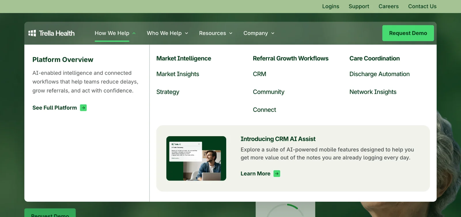
We married SEO and UX on the page itself. On the key pages, the eyebrow and the H1 carry the exact phrase buyers search, so the first thing a person reads and the first thing Google reads are the same.
After launch, Trella ranked #1 for “post-acute care sales platform,” non-branded bottom-of-funnel clicks rose about 33%, and engagement time per session went from 10 seconds to 28, up about 174% against the prior period.
Website Results
AlayaCare makes home healthcare software for home care and community care providers. This was a Takeoff redesign, and the brief was less “fix the old site” and more “build the site the company is growing into.”
What the site does differently. We rebuilt the positioning around where AlayaCare is headed, not where it started. The old site sold a “cloud-based solution.” The new one leads with “the intelligent operating system for home care” and threads AI through the story, so the site matches the company’s actual direction instead of lagging a year behind it.
Why it works. Messaging clarity for a platform serving several types of care organizations. The redesign gives one confident through-line that still lets home care, home health, and infusion buyers find themselves.
What we like about it
Website Results
Freshpaint is a healthcare marketing analytics and privacy platform, and this was a Takeoff build. Its buyers run modern advertising while staying inside HIPAA and a widening set of privacy rules, which puts legal and compliance in the buying committee right next to marketing.
What the site does differently. The hard part was selling a performance benefit and a compliance benefit without splitting into two competing pitches. The site resolves it on one page: “Turn Privacy Into A Strategic Advantage That Fuels Performance.” Privacy isn’t the tax on performance, it’s the lever. We shipped the web design, development, SEO, AEO, and animation on a tight timeline, with the technical migration run as its own workstream so nothing dropped at launch.
Why it works. Messaging clarity under real tension. Two buyers who usually pull in opposite directions get one message that serves both, so marketing and compliance nod at the same headline.
What we like about it
Website Results

Abridge builds generative AI for clinical documentation for health systems. When an AI vendor pitches a hospital, the first question is “can we trust it,” and Abridge answers before you ask.
What the site does differently. The proof lives in the main scroll, not a buried case-studies page: “100M+ conversations powered each year,” partner stories from Kaiser Permanente, Johns Hopkins, Duke, and Yale New Haven, and Best in KLAS recognition for 2025 and 2026.
Why it works. The evidence and trust layer done right. A committee vetting an AI vendor gets scale, named peers, and third-party validation in the first few screens, which is the exact credibility case they have to make internally.
What we like about it

Virta Health sells metabolic health treatment to employers and health plans, while individuals are the end users. Two very different buyers, and most companies here force them onto one confused page.
What the site does differently. Virta splits cleanly. “Virta for Individuals” and “Virta for Organizations” are separate paths, called out in the nav and again under the hero, so the B2B buyer and the patient never compete for the same message.
Why it works. Pure committee routing. The employer or health-plan buyer gets population outcomes and GLP-1 access, the patient gets weight loss and diabetes reversal, and neither wades through the other’s pitch.
What we like about it

Cedar runs a patient financial engagement platform for providers and health systems. The buyer is a revenue cycle or finance leader, and the site talks to them in their language: money.
What the site does differently. The messaging leads with performance and partnership, not features. The hero reads “Built for patients. Powered by intelligence. Proven in performance,” and the subhead frames it all as “stronger margins for providers.” A results section and a wall of provider quotes back it up.
Why it works. The value proposition reads as a financial outcome the buyer can take to their boss, not a feature list they’d have to translate. Messaging clarity aimed at the economic buyer.
What we like about it

Commure sells an AI revenue cycle and ambient documentation platform to health systems. Revenue cycle is a sprawling problem, and Commure organizes the site the way a finance team already thinks about it.
What the site does differently. The platform is laid out by revenue cycle stage, not product name. “Front End: Patient Access,” “Mid Cycle: Clinical Intelligence,” and “Back End: Revenue Integrity” each hold the relevant capabilities, so a buyer maps the site to their own workflow instantly.
Why it works. Committee routing by mental model. A revenue cycle leader thinks in stages, not SKUs, and the site mirrors that, which makes a complicated platform feel navigable.
What we like about it

Komodo Health sells a healthcare data and AI platform to life sciences and healthcare organizations. Its buyers aren’t shopping for a database, they’re trying to answer hard questions faster, and the hero meets them there.
What the site does differently. The headline leads with the buyer’s actual job: “Ask Any Question About Healthcare and Get an Answer You Can Use.” Then the customer quotes quantify the gain instead of praising the product. One, from Novo Nordisk, notes a study that used to take six months now runs over a weekend.
Why it works. Messaging clarity plus a sharp evidence layer. The site frames the problem the way the buyer feels it, then proves the payoff with a specific, measurable result from a named customer.
What we like about it
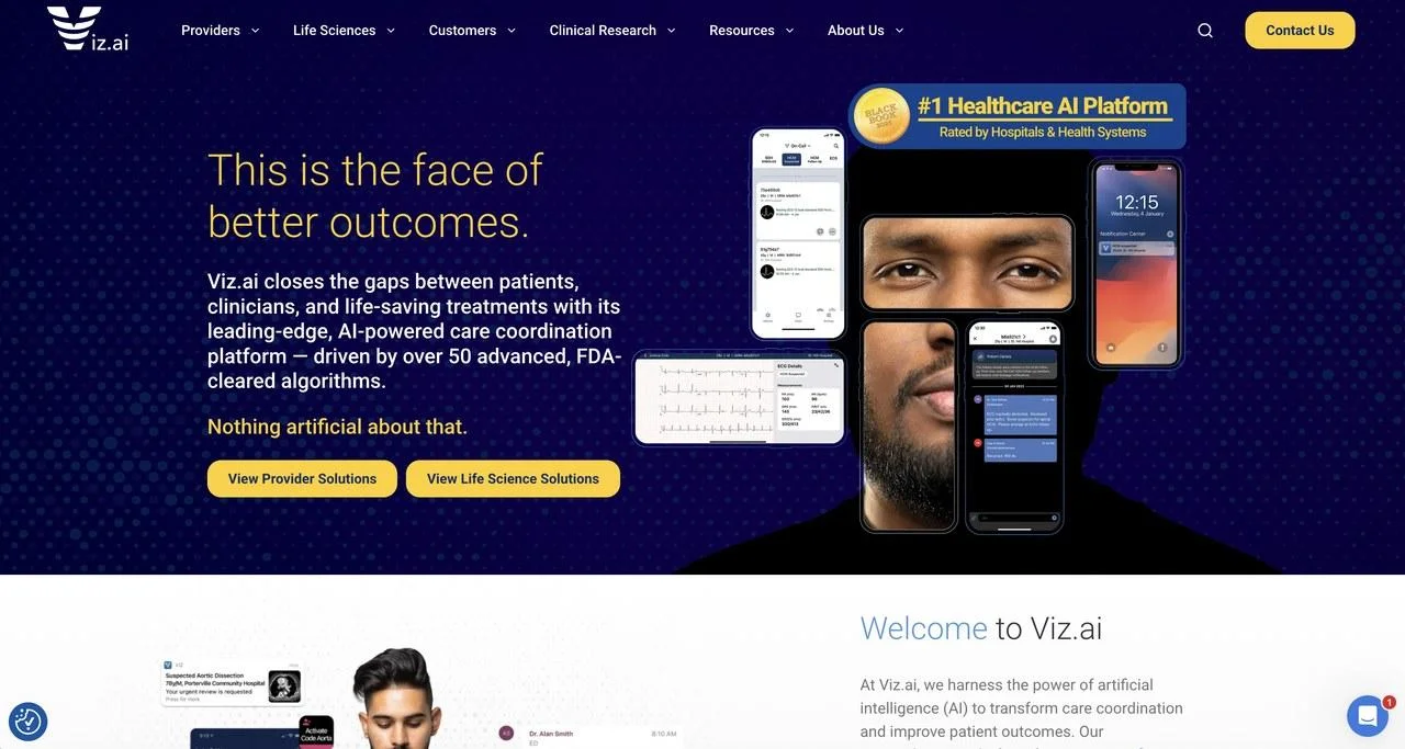
Viz.ai runs an AI care coordination platform for hospitals and health systems. In this category the first question is clinical: is this validated, and does it work in the real world?
What the site does differently. Clinical validation sits near the top. The hero cites “over 50 advanced, FDA-cleared algorithms” and a #1 Healthcare AI Platform rating, so the proof lands before the pitch. From there the site routes buyers by clinical specialty, with Neuro, Cardio, Vascular, and Trauma suites, so each clinical champion lands on evidence for their own service line.
Why it works. Evidence layer and committee routing reinforcing each other. A neuro lead and a cardio lead have different evidence needs, and the site sends each to their own proof.
What we like about it
Here’s the thread running through all nine: the sites that work were built for a buying committee, not a brochure. And that only happens when strategy, design, development, SEO, and AEO work off the same plan. That’s what we do at Takeoff.
We’re a B2B web design agency for established companies with long sales cycles, and healthcare is one of the industries we know best. A few things we’d bring to your redesign, all of which map to what made the examples above work:
Separate paths for the clinical champion, the administrator, IT, and procurement, so each member of the committee finds what they need. The committee routing you saw on Trella, Virta, and Viz.ai.
Strategy before design. Stakeholder workshops, persona research for each buyer, and a full site audit happen before anyone opens Figma, so the page map is settled first.
SEO and AEO built into the rebuild, with a 55-point redirect map, so non-branded traffic survives the migration instead of cratering. It’s why Freshpaint’s conversions went up at launch, not down.
A component system your marketing team runs without filing developer tickets for every edit.
A senior project manager on every project, and you own the Figma files, editor access, and code from day one. No lock-in.
CMS-agnostic and a Certified Webflow Partner, with a standard project running about 14 weeks.
If this is the kind of redesign you’re weighing, we should talk. Takeoff builds the site that convinces the whole committee, and we can walk you through real client examples, step by step, on a call.
“I’ve been through 12 website launches in my career and I want to give some well-deserved credit to Takeoff for delivering the best experience I’ve had to date.”
Kristine Champion, Senior VP of Marketing, AuthenticID
See our B2B Healthcare Web Design Agency page and our website redesign services, or get a quote and let’s talk.
Ready to talk?
Request a Quote or email lenny@takeoffnyc.com to start the conversation.



Author
Lenny Rozental